Accesible modal using Bootstrap and React portals
March 10, 2021 - 10 min readI know it has been a while and I haven’t post anything in a while, I’ve been busy lately, but I have been doing a lot of React development using typescript, some Prisma, NestJS fun stuff in the backend. Now let’s get started.
I’m not a huge fan of reactstrap and react bootstrap because I enjoy doing things manually by myself. So, I decided to try and build the modal core functionality(almost) by myself, excluding the styles, which will be installed using the bootstrap dependency, while creating something that is accessible and uses the latest react stuff (hooks, portals).
At first let’s create a new react project using typescript (not required, but it will be better to type our things better.
yarn create react-app react-bootstrap-modal --template typescript
After that let’s install the dependencies that will be needed:
yarn add bootstrap@next node-sass
Now let’s rename our index.css file to main.scss and remove all the content inside and just add this line:
@import '~bootstrap/scss/bootstrap.scss';Remember to change the index.tsx import to match the new file and let’s leave our App.tsx like this:
import React from 'react';
function App() {
return (
<div className="App">
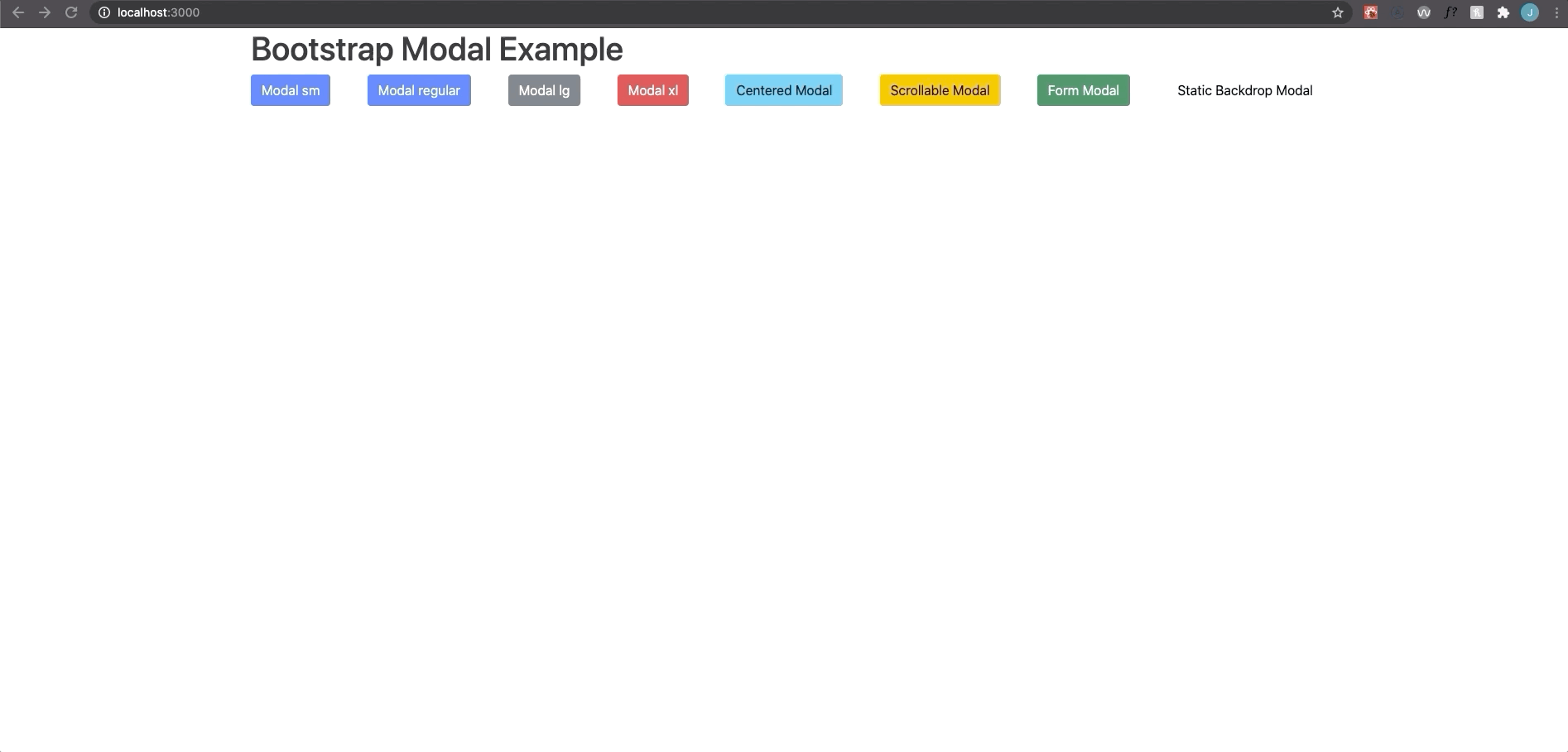
<h1>Bootstrap Modal Example</h1>
</div>
);
}
export default App;With that set up we will create a a components/Modal folder were we will have all the modal related logic.
At first we will create a React Portal that will be acting as an overlay shadow that appears when you open the modal:
// components/Modal/ModalOverlay/index.tsx
import ReactDOM from 'react-dom'

export default function ModalOverlay() {
  return ReactDOM.createPortal(
    <div className='modal-backdrop fade show' />,
    document.body,
  )
}
Now let’s create the next component that is the one that will open the modal, the ModalButton, this one will be a regular button and it will also receive a reference and this will make us to access the dom element in the parent modal component. Let’s create the interface, but first let’s create a file for all the shared types used in the modal component.
// components/Modal/shared.types.ts
import React from 'react'

export type BtnRef =
  | string
  | ((instance: HTMLButtonElement | null) => void)
  | React.RefObject<HTMLButtonElement>
  | null
  | undefined

type CallbackChildren = (close: () => void) => React.ReactNode

export type MainChildren = React.ReactNode | CallbackChildren

export type ModalSize = 'sm' | 'lg' | 'xl'- BtnRef is a prop to hold a DOM reference and we need to add those extra typings to be able to use the useRef hook.
- MainChildren is type that accepts a callback function that we would use if we need the children of the modal close the modal programmatically, also it supports a regular ReactNode if you don’t need to close the modal with it’s children.
- Modal size is a styling prop to match bootstrap modal sizes
With an overview of the shared types we will use, this is the code for the props that the ModalButton will receive
// components/Modal/ModalButton/ModalButton.interfaces.ts
import React from 'react'

import { BtnRef } from '../shared.types';

export interface Props extends React.ButtonHTMLAttributes<HTMLButtonElement> {
  buttonRef: BtnRef
}
As you can see the component inherits the props from a React button, so we can use the regular button tag props and also, we added a reference custom prop. Next let’s create the component.
// components/Modal/ModalButton/index.tsx
import React from 'react'

import {Props} from './ModalButton.interfaces'

export default function ModalButton({
  buttonRef,
  children,
  type = 'button',
  ...rest
}: Props) {
  return (
    <button ref={buttonRef} type={type} {...rest}>
      {children}
    </button>
  )
}
We’re basically just adding the ref to the component and then attaching the rest of regular props of the button, using the ...rest that holds all the missing props. Pretty nice uh! This pattern is pretty helpful to create custom components.
With that in mind let’s start building the modal content, this component will be the modal dialog that contains all the info related to the modal. Keeping the same approach let’s write the Props first
// components/Modal/ModalContent/ModalContent.interfaces.ts
import React from 'react'

import { BtnRef, MainChildren, ModalSize } from '../shared.types'

export interface Props {
  ariaLabel?: string
  buttonRef: BtnRef
  center: boolean
  footerChildren?: MainChildren
  open: boolean
  mainChildren: MainChildren
  modalRef: React.RefObject<HTMLDivElement>
  onClickAway: (event: React.MouseEvent<HTMLDivElement, MouseEvent>) => void
  onClose: () => void
  onKeyDown: ((event: React.KeyboardEvent<HTMLDivElement>) => void) | undefined
  size: ModalSize
  scrollable: boolean
  title?: string
}
We will not talk about all the props but some of them are handlers to close the modal and a few are for styling, the mainChildren and footerChildren can be a ReactNode or they can also be a function, which is the type we created in the shared types, it works as a function that returns a ReactNode, we also hold a BtnRef that will be used for the X that closes the modal.
For the modal content we are going to create a hook to allow focus only in the modal dialog when the dialog is open.
// hooks/useFocusTrap.ts
import React from 'react'

const KEYCODE_TAB = 9

const FOCUSABLE_ELEMENTS =
  'a, button, input, textarea, select, details, [tabindex]:not([tabindex="-1"])'

export function useFocusTrap() {
  const ref = React.useRef<HTMLDivElement>(null)

  // Focus trap function
  function handleFocus(event: KeyboardEvent) {
    // Array of all the focusable elements in the array.
    const focusableEls = [
      ...ref.current!.querySelectorAll(FOCUSABLE_ELEMENTS),
    ].filter((el) => !el.hasAttribute('disabled')) as HTMLElement[]
    // First focusable element
    const firstFocusableEl = focusableEls[0]
    // Last focusable element
    const lastFocusableEl = focusableEls[focusableEls.length - 1]

    const isTabPressed = event.key === 'Tab' || event.keyCode === KEYCODE_TAB

    // Logic to focus only the current modal focusable items.
    if (!isTabPressed) {
      return
    }

    if (event.shiftKey) {
      if (document.activeElement === firstFocusableEl) {
        lastFocusableEl.focus()
        event.preventDefault()
      }
    } else if (document.activeElement === lastFocusableEl) {
      firstFocusableEl.focus()
      event.preventDefault()
    }
  }

  React.useEffect(() => {
    // Add event listener to focus trap
    const currentRef = ref.current!
    currentRef.addEventListener('keydown', handleFocus)

    return () => {
      // rRemove event listener to focus trap
      currentRef.removeEventListener('keydown', handleFocus)
    }
  }, [])

  return ref
}
With that hook created we need to install this kebabcase transformer utility just for displaying the aria-labelledby attribute in kebab-case
yarn add lodash.kebabcase
yarn add -D @types/lodash.kebabcase
Now let’s create the ModalContent component.
// components/Modal/ModalContent/index.tsx
import kebabCase from 'lodash.kebabcase'
import React from 'react'

import { useFocusTrap } from '../../../hooks'

import { MainChildren } from '../shared.types'

import { Props } from './ModalContent.interfaces'

const TIMEOUT_VALUE = 300

export default function ModalContent({
  ariaLabel,
  buttonRef,
  center,
  footerChildren,
  mainChildren,
  modalRef,
  onClickAway,
  onClose,
  onKeyDown,
  open,
  size,
  scrollable,
  staticBackdrop,
  title,
}: Props) {
  const [staticAnimation, setStaticAnimation] = React.useState(false)
  const [staticClass, setStaticClass] = React.useState('')
  const [openClass, setOpenClass] = React.useState('')
  const dialogRef = useFocusTrap()
  const scrollClass = scrollable ? ' modal-dialog-scrollable' : ''
  const verticalCenterClass = center ? ' modal-dialog-centered' : ''

  React.useEffect(() => {
    const timer = setTimeout(() => {
      setOpenClass(open ? ' show' : '')
    }, TIMEOUT_VALUE);
    return () => clearTimeout(timer);
  }, [open]);

  React.useEffect(() => {
    const timer = setTimeout(() => {
      setStaticClass(staticAnimation ? ' modal-static' : '')
    }, TIMEOUT_VALUE);
    return () => clearTimeout(timer);
  }, [staticAnimation]);

  const staticOnClick = () => setStaticAnimation(!staticAnimation)

  const render = (content: MainChildren) =>
    typeof content === 'function' ? content(onClose) : content

  return (
    <div
      ref={dialogRef}
      className={`modal fade${staticClass}${openClass}`}
      aria-labelledby={kebabCase(ariaLabel)}
      tabIndex={-1}
      onClick={staticBackdrop ? staticOnClick : onClickAway}
      onKeyDown={onKeyDown}
      style={{
        display: open ? 'block' : 'none',
        ...(openClass && {paddingRight: '15px'}),
        ...(staticAnimation && {overflow: 'hidden'})
      }}
      {...(open ? {'aria-modal': true, role: 'dialog'} : {'aria-hidden': true})}
    >
      <div
        className={`modal-dialog modal-${size}${scrollClass}${verticalCenterClass}`}
        ref={modalRef}
      >
        <div className='modal-content'>
          <div className='modal-header'>
            {title && <h5>{title}</h5>}
            <button
              type='button'
              className='btn-close'
              aria-label='close-modal'
              onClick={onClose}
              ref={buttonRef}
            />
          </div>
          <div className='modal-body'>{render(mainChildren)}</div>
          {footerChildren && (
            <div className='modal-footer'>{render(footerChildren)}</div>
          )}
        </div>
      </div>
    </div>
  )
}
Basically this component will always have the modal header, since we need the X button to close the modal, the X button holds a buttonRef as well because we want the parent (Modal component) to do some stuff with that element, the other important thing to mention is the render function inside the stateless ModalContent component, which basically checks if the content passed if a function and runs it, if not it will be a ReactNode element and it does not need any additional configuration. Also the useEffect try to replicate some of the animation generated by bootstrap (still missing the close animation). The other stuff is pretty basic, conditional classes depending on the open prop and the footerChildren that can be optional.
Now let’s create the modal component:
import React from 'react'

import { Props } from './Modal.interfaces'
import ModalContent from './ModalContent'
import ModalOverlay from './ModalOverlay'
import ModalButton from './ModalButton'

export default function Modal({
  ariaLabel,
  btnClassName,
  btnContent,
  center = false,
  children,
  footerChildren,
  size = 'lg',
  scrollable,
  title,
}: Props) {
  const [open, setOpen] = React.useState(false)
  const btnOpenRef = React.useRef<HTMLButtonElement>(null)
  const btnCloseRef = React.useRef<HTMLButtonElement>(null)
  const modalNode = React.useRef<HTMLDivElement>(null)
  const ESCAPE_KEY = 'Escape'

 // Effect to focus X button when open and focus button that toggles modal when closed
  React.useEffect(() => {
    if (open) {
      btnCloseRef.current!.focus()
    } else {
      btnOpenRef.current!.focus()
    }
  }, [open])

  // Lock Scroll by togglinh the modal-open class in the body
  function toggleScrollLock() {
    document.querySelector('body')!.classList.toggle('modal-open')
  }

  const onOpen = () => {
    setOpen(true)
    toggleScrollLock()
  }

  const onClose = () => {
    setOpen(false)
    toggleScrollLock()
  }

  const onKeyDown = (event: React.KeyboardEvent<HTMLDivElement>) => {
    if (event.key === ESCAPE_KEY) {
      onClose()
    }
  }

  // When clicking the overlay the modal will be closed.
  const onClickAway = (event: any) => {
    if (modalNode.current && !modalNode.current.contains(event.target)) {
      onClose()
    }
  }

  return (
    <>
      <ModalContent
        ariaLabel={ariaLabel}
        buttonRef={btnCloseRef}
        center={center}
        footerChildren={footerChildren}
        open={open}
        mainChildren={children}
        modalRef={modalNode}
        onClickAway={onClickAway}
        onClose={onClose}
        onKeyDown={onKeyDown}
        size={size}
        scrollable={scrollable}
        title={title}
      />
      {open && <ModalOverlay />}

      <ModalButton
        onClick={onOpen}
        className={btnClassName}
        buttonRef={btnOpenRef}
      >
        {btnContent}
      </ModalButton>
    </>
  )
}
This component is pretty basic, it just open and closes the modal with a few event handlers, it also stores the button open and button close references, to focus based on the open state. The toggleScrollLock adds a class that prevents the overflow from the body, so you can only scroll the modal if applicable.
And now you just have to use the modal like this:
import React from 'react'

import Modal from './components/Modal'


function App() {
  return (
    <div className="container">
      <h1>Bootstrap Modal Example</h1>
      <Modal
        ariaLabel='Modal Example'
        btnClassName="btn btn-primary"
        btnContent='Modal regular'
        footerChildren={(closeModal) => (
            <button
              type='button'
              className='btn btn-primary'
              onClick={closeModal}
            >
              Close it from the child
            </button>
        )}
        title='Modal Example regular'
      >
        <p>This is a regular Modal</p>
      </Modal>
      <Modal
        ariaLabel='Modal Example lg'
        btnClassName="btn btn-secondary"
        btnContent='Modal lg'
        size='lg'
        footerChildren={(closeModal) => (
            <button
              type='button'
              className='btn btn-primary'
              onClick={closeModal}
            >
              Close it from the child
            </button>
        )}
        title='Modal Example lg'
      >
        <p>This is a large Modal</p>
      </Modal>
    </div>
As you can see you can pass a ReactNode or a (closeModal: () => void) => ReactNode for your footer and the main content, this will help us to close the modal from the children content which is pretty useful when doing forms or things that require the help from the children to close it.
Hope you enjoy the post, converting this to JS should be pretty straight forward, but the idea is the same, this is pretty neat because it focus the elements tie to the modal.
Here’s the repo in case you want to check the code.

Built and mantained by Jean Aguilar
Nobody likes you when you're twenty three