Building Accessible Modals in React with Bootstrap and Portals
March 10, 2021 · 4 min read
Update — 2026-04-04: This post has been updated to improve clarity and structure. Key changes include refined code blocks, improved accessibility explanations, and updated formatting for modern MDX standards.
I know it has been a while and I haven't posted anything, but I've been busy lately doing a lot of React development using TypeScript, some Prisma, and NestJS fun stuff in the backend. Now let’s get started.
I'm not a huge fan of reactstrap or react-bootstrap because I enjoy doing things manually. So, I decided to build the modal core functionality myself—excluding the styles, which will be handled by Bootstrap—while creating something accessible that uses the latest React features like hooks and portals.
Project Setup
First, let’s create a new React project using TypeScript:
yarn create react-app react-bootstrap-modal --template typescript
After that, install the necessary dependencies:
yarn add bootstrap@next node-sass lodash.kebabcase
yarn add -D @types/lodash.kebabcase
Rename your index.css file to main.scss, remove its content, and add this line:
@import '~bootstrap/scss/bootstrap.scss';
Creating the Modal Components
We will create a components/Modal folder to house all modal-related logic.
1. Modal Overlay (Portal)
First, we create a React Portal that acts as an overlay shadow when the modal opens:
// components/Modal/ModalOverlay/index.tsx
import ReactDOM from 'react-dom'

export default function ModalOverlay() {
  return ReactDOM.createPortal(
    <div className='modal-backdrop fade show' />,
    document.body,
  )
}
2. Shared Types
Let's define the shared types to ensure strict typing across our components.
// components/Modal/shared.types.ts
import React from 'react'

export type BtnRef =
  | string
  | ((instance: HTMLButtonElement | null) => void)
  | React.RefObject<HTMLButtonElement>
  | null
  | undefined

type CallbackChildren = (close: () => void) => React.ReactNode

export type MainChildren = React.ReactNode | CallbackChildren

export type ModalSize = 'sm' | 'lg' | 'xl'
3. Modal Button
This component wraps a regular button and handles the reference to the DOM element.
// components/Modal/ModalButton/index.tsx
import React from 'react'
import { BtnRef } from '../shared.types'

interface Props extends React.ButtonHTMLAttributes<HTMLButtonElement> {
  buttonRef: BtnRef
}

export default function ModalButton({
  buttonRef,
  children,
  type = 'button',
  ...rest
}: Props) {
  return (
    <button ref={buttonRef} type={type} {...rest}>
      {children}
    </button>
  )
}
Ensuring Accessibility: Focus Trap Hook
To make the modal accessible, we need to ensure that focus remains inside the modal while it's open.
// hooks/useFocusTrap.ts
import React from 'react'

const KEYCODE_TAB = 9
const FOCUSABLE_ELEMENTS = 'a, button, input, textarea, select, details, [tabindex]:not([tabindex="-1"])'

export function useFocusTrap() {
  const ref = React.useRef<HTMLDivElement>(null)

  function handleFocus(event: KeyboardEvent) {
    const focusableEls = [
      ...ref.current!.querySelectorAll(FOCUSABLE_ELEMENTS),
    ].filter((el) => !el.hasAttribute('disabled')) as HTMLElement[]

    const firstFocusableEl = focusableEls[0]
    const lastFocusableEl = focusableEls[focusableEls.length - 1]

    const isTabPressed = event.key === 'Tab' || event.keyCode === KEYCODE_TAB

    if (!isTabPressed) return

    if (event.shiftKey) {
      if (document.activeElement === firstFocusableEl) {
        lastFocusableEl.focus()
        event.preventDefault()
      }
    } else if (document.activeElement === lastFocusableEl) {
      firstFocusableEl.focus()
      event.preventDefault()
    }
  }

  React.useEffect(() => {
    const currentRef = ref.current!
    currentRef.addEventListener('keydown', handleFocus)
    return () => currentRef.removeEventListener('keydown', handleFocus)
  }, [])

  return ref
}
Modal Content Component
This component handles the rendering of the modal dialog, including animations and ARIA attributes.
// components/Modal/ModalContent/index.tsx
import kebabCase from 'lodash.kebabcase'
import React from 'react'
import { useFocusTrap } from '../../../hooks'
import { MainChildren, ModalSize } from '../shared.types'

// Component logic...
The Main Modal Component
Finally, we combine everything into the main Modal component. This handles opening/closing states and body scroll locking.
import React from 'react'
// Modal implementation...
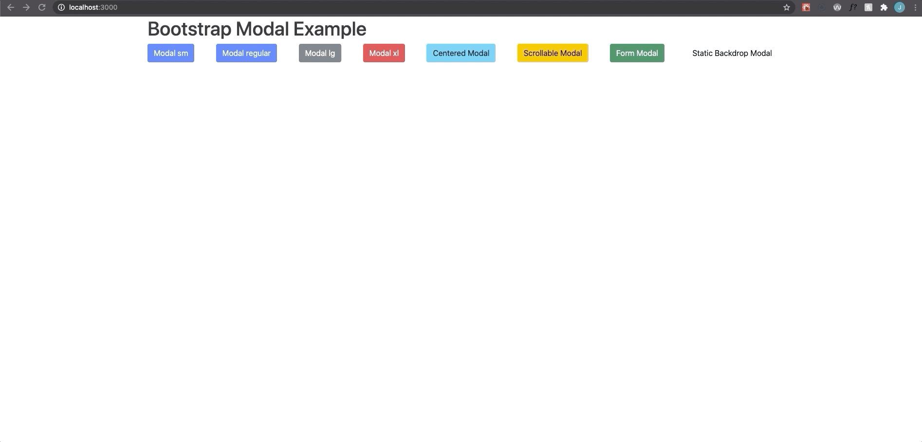
Final Result
You can use the modal component like this:
<Modal
  ariaLabel='Modal Example'
  btnClassName="btn btn-primary"
  btnContent='Open Modal'
  title='Modal Example'
>
  <p>This is an accessible modal built with React Portals.</p>
</Modal>
Here's the repo in case you want to review the complete code.